
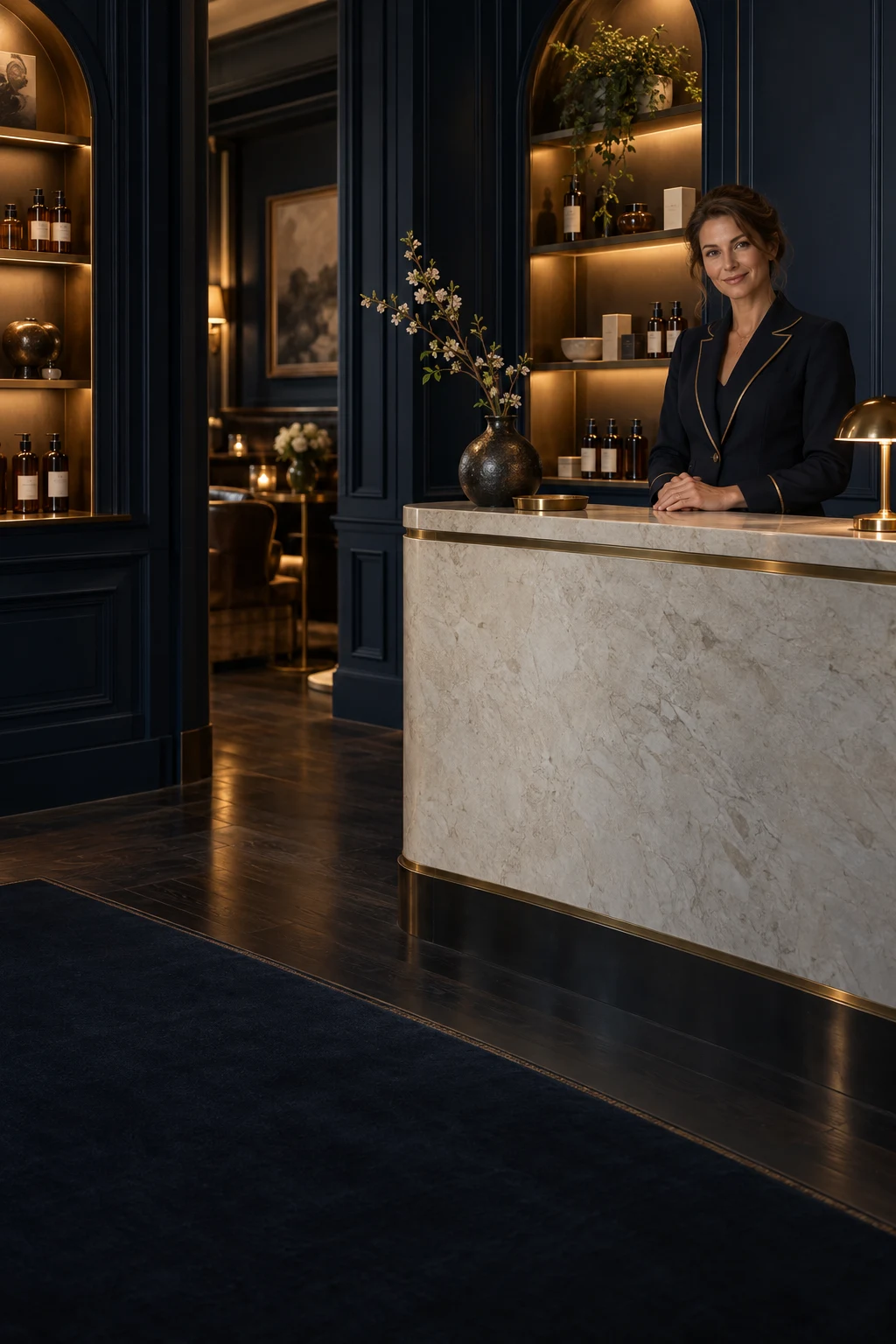
Navy, ivory and warm metallic tones can create a striking contrast without requiring a room to feel theatrical. Navy gives the eye a place to rest, ivory introduces lightness, and a small brass-coloured detail can provide a point of warmth. The combination is most effective when it supports ordinary use rather than demanding attention from every object.
On a bathroom shelf, the palette can be modest: a dark bottle, a pale towel, a suitable tray and enough space between them. This guide explores how to bring that visual relationship into a practical room. It is an approach to arrangement, not a requirement to replace every fixture or purchase a matching collection.
Choose a dominant colour
Begin with one colour that will occupy most of the visible area. In a small bathroom, the existing walls or counter may already provide an ivory or pale background. You can then use navy as an accent rather than trying to introduce it on every surface.
If the room is already dark, a lighter towel or clear pale area may provide the useful contrast. Work with what exists before adding new objects. The best palette decisions often come from subtraction and placement rather than another purchase.
Avoid giving all three tones equal weight simply because they form a named combination. A dominant colour, a supporting shade and a small accent can create a clearer visual hierarchy. The eye should understand the arrangement without having to decide which object is the centre.
Use navy as an anchor
A navy bottle, small container or suitable accessory can create a visual anchor. Place it where it has room to be recognised, rather than surrounding it with several equally dark objects. The effect comes from contrast as much as from the colour itself.
Consider the actual light in the room. A shade that appears richly blue in daylight may look almost black under another lamp. Judge it where it will live. Screen images and catalogue photographs cannot show exactly how a colour will behave beside your existing materials.
The anchor should still have a practical role. A daily product or useful organiser earns its place more naturally than a decorative object that must be moved every time you reach for the basin. Function gives the colour a reason to remain.
Let ivory create breathing space
Ivory and similar pale tones can help separate objects visually. A towel, a clean counter or a suitable tray can provide a quiet background for darker packaging. The value lies partly in the open area around the object, not only in the pale material itself.
Keep the surface easy to maintain. A decorative pale textile placed beneath wet bottles may become inconvenient, while a suitable wipeable surface could serve the room better. Choose materials for the conditions they will encounter.
You do not need an exact shade match across every item. Slight differences can feel natural when the overall arrangement is restrained. Focus on whether the tones sit comfortably together in the room rather than chasing identical colour values from different materials.
Treat metallic tones as punctuation
A warm metallic detail can provide a small point of interest: a suitable tray edge, a fixture or a packaging accent. It is often most effective in moderation. If every object shines, the room can lose the quiet hierarchy created by the darker and lighter tones.
Consider maintenance and material suitability. A decorative finish may react poorly to constant water exposure or require care you do not want to provide. Follow the item's instructions and choose a practical location rather than placing it directly in a wet area for appearance alone.
Metallic-looking colour and actual metal are different material choices. You can enjoy the visual warmth of a gold or brass tone without implying a precious finish. The important design question is how the accent relates to the whole setting.
Work with the product labels
Personal-care packaging brings its own typography, colour and information. Rather than hiding every label to create a uniform display, arrange the products so they are readable and easy to identify. Clarity can be part of the aesthetic.
A navy bottle against a pale background may already provide the contrast you want. Additional decorative containers could be unnecessary. Keeping original packaging also preserves directions, ingredients and dates that remain useful during use.
If several products have different designs, group the everyday items by purpose and leave space between groups. A room does not need every brand to match in order to feel considered. Order can come from consistent placement and a limited number of visible items.
Choose a tray for the routine
A tray can define the working collection, but its size and material should suit the environment. It needs enough room to lift bottles easily and should not trap standing water. Consider how it will be cleaned and whether it remains stable on the chosen surface.
Do not buy the tray first and then fill it to capacity. Start with the products you use and choose an appropriate boundary around them. A little empty space makes the grouping easier to handle and visually calmer.
If the room is small, a tray may not be necessary at all. A clearly designated section of the shelf can serve the same purpose. The design principle is a visible, usable grouping, not the compulsory presence of an accessory.
Use textiles for comfort and contrast
Towels and robes add a tactile element to the palette. Choose them for comfort, care requirements and drying conditions as well as appearance. A thick towel can look luxurious but be impractical if the room does not allow it to dry suitably.
A pale textile can lighten a darker setting, while a navy accent may connect with the packaging. Keep the number manageable so that storage and drying remain easy. A small, well-maintained selection can feel more considered than a large decorative stack.
Follow textile care instructions and keep fresh oils or other residues away from delicate materials. The visual arrangement should not create extra laundry problems. Practical upkeep is part of the lasting quality of the room.
Make lighting useful first
The palette should be assessed under the lighting you actually use. You need enough illumination to read labels, groom and notice water or product residue. A soft atmosphere is pleasant only when the room remains easy to navigate.
Avoid relying on a decorative lamp or low light to conceal a cluttered surface. Organise the space first. Once the practical needs are met, the existing lighting may already provide the atmosphere you want without further additions.
If making changes to fixtures or electrical equipment, use appropriate professional help and follow relevant safety requirements. A styling idea should not encourage improvised electrical arrangements in a wet environment. The room's function remains the foundation.
Edit the composition from a normal viewpoint
Stand where you ordinarily use the basin and look at the shelf. Is the daily product easy to identify? Can you reach it without moving another item? Does the palette feel clear from that position, rather than only from a carefully chosen photograph angle?
Move one object at a time. You may find that spacing creates a stronger improvement than changing colour. A bottle shifted away from a busy label or a towel moved to a clearer position can give the arrangement more coherence.
Then use the room normally. If the styling falls apart immediately because items have no practical homes, revise it. A successful composition is one that can be reset naturally after everyday use.
Style one shelf using what is already present
Imagine a bathroom with a pale counter, a navy product bottle, a chrome tap and two towels in slightly different ivory tones. The owner likes a navy, ivory and brass palette but initially assumes that every fixture and textile must be replaced to achieve it. A more practical exercise begins with the existing relationships.
The pale counter already provides the main field. The navy bottle can become the visual anchor if it is given a clear position and some space. The towels do not need to match perfectly; they need to look comfortable together under the room's actual light and remain practical to care for.
The chrome tap can stay. A palette is a design guide, not a demand to erase every existing material. If a warm accent is still desired, one suitable object may provide it without requiring a full fixture change. The accent should have a useful role and appropriate care requirements for its location.
Before adding anything, the owner removes unrelated products from the working area and groups daily items by use. The arrangement becomes clearer immediately. This reveals that the original problem was partly crowding, not a missing colour. The best visual improvement may have come from space rather than purchase.
They then evaluate the shelf from the normal standing position at the basin. Can the label be read? Can the bottle be lifted without touching another object? Does the towel have a proper drying place? These questions connect the palette to ordinary use instead of judging it only through a carefully framed photograph.
A week later, the owner reviews the reset. If the bottle naturally returns to the chosen place and the surface remains easy to clean, the composition is working. If a decorative object is constantly moved aside, it may not belong in the active area. The room's behaviour provides useful design feedback.
This exercise can be repeated with another existing palette. The principle is a dominant field, a clear anchor and restrained accents, all supported by practical placement. Exact colour matching is less important than a coherent relationship that survives the lighting, materials and daily actions of the actual room.
A considered interior does not need to announce that it follows a formula. It should feel easy to inhabit. When the palette serves the routine, the visual pleasure becomes part of everyday use rather than something preserved only while the room remains untouched.
Keep a small visual accent away from the main handling area if it has no daily function. The palette can remain visible without making the routine navigate around it.
Keep the palette personal
Navy, ivory and warm metallic tones provide a useful starting point, but they need not become a rigid rule. A familiar wooden object, a favourite towel or an existing fixture can belong even if it falls outside the exact palette. Personal details give the room life.
The aim is a setting that feels calm to look at and straightforward to use. Colour supports that aim through contrast and restraint. It should not demand that you remove every meaningful object or replace materials that work well.
A considered shelf is a small composition of useful things. When colour, spacing and function agree, the room gains an atmosphere that feels deliberate without feeling staged.
